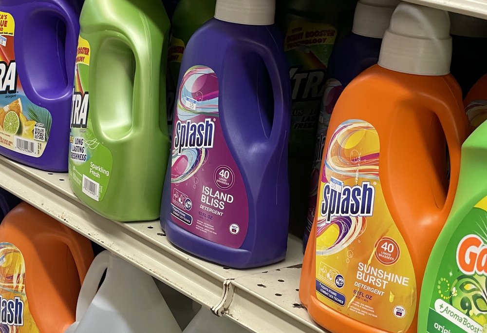
Splash Laundry Detergent
Packaging for a laundry detergent with a point of view.

Overview
Splash needed a pack that could hold its own on a crowded shelf and say what the detergent actually does: it cleans, it feels fresh, and it is easier on the environment.
Services
Label Design
Challenge
Detergent packaging tends to look the same. Splash had to show cleaning power, freshness, and a lighter footprint without a wall of badges.
What we did
Set the visual direction for the pack.
Designed the packaging around power, freshness, and the eco story.
Made the name the first thing you see.
Outcome
A pack you can read from the aisle: clean, fresh, and clearly Splash.
Our approach
We treated the bottle as the poster. The name carries the freshness. Color and form carry the cleaning power. The environmental story stays visible, but it does not take over the front.
Shoppers decide in a second. The design gives them that second, and nothing they have to decode.