Disprophar
A modular identity for a pharmaceutical distributor.

Overview
Disprophar has distributed and promoted pharmaceutical products since 1987. People knew its blue loop, but the logo read like a stock medical icon and had no system behind it.
Services
Logo Design
Brand Identiy
Challenge
The loop was familiar, but it looked generic, lost detail at small sizes, and came with type that didn't match. There was nothing in place to keep it consistent.
What we did
Kept the equity. After nearly 40 years, the blue and the loop were already Disprophar's, so we built on them instead of starting over.
Turned a generic icon into an owned asset: a refined dp / infinity loop that reads at a glance and holds up down to a favicon.
Paired it with a clean wordmark that brings clarity and authority, chosen from four typography routes in the final round.
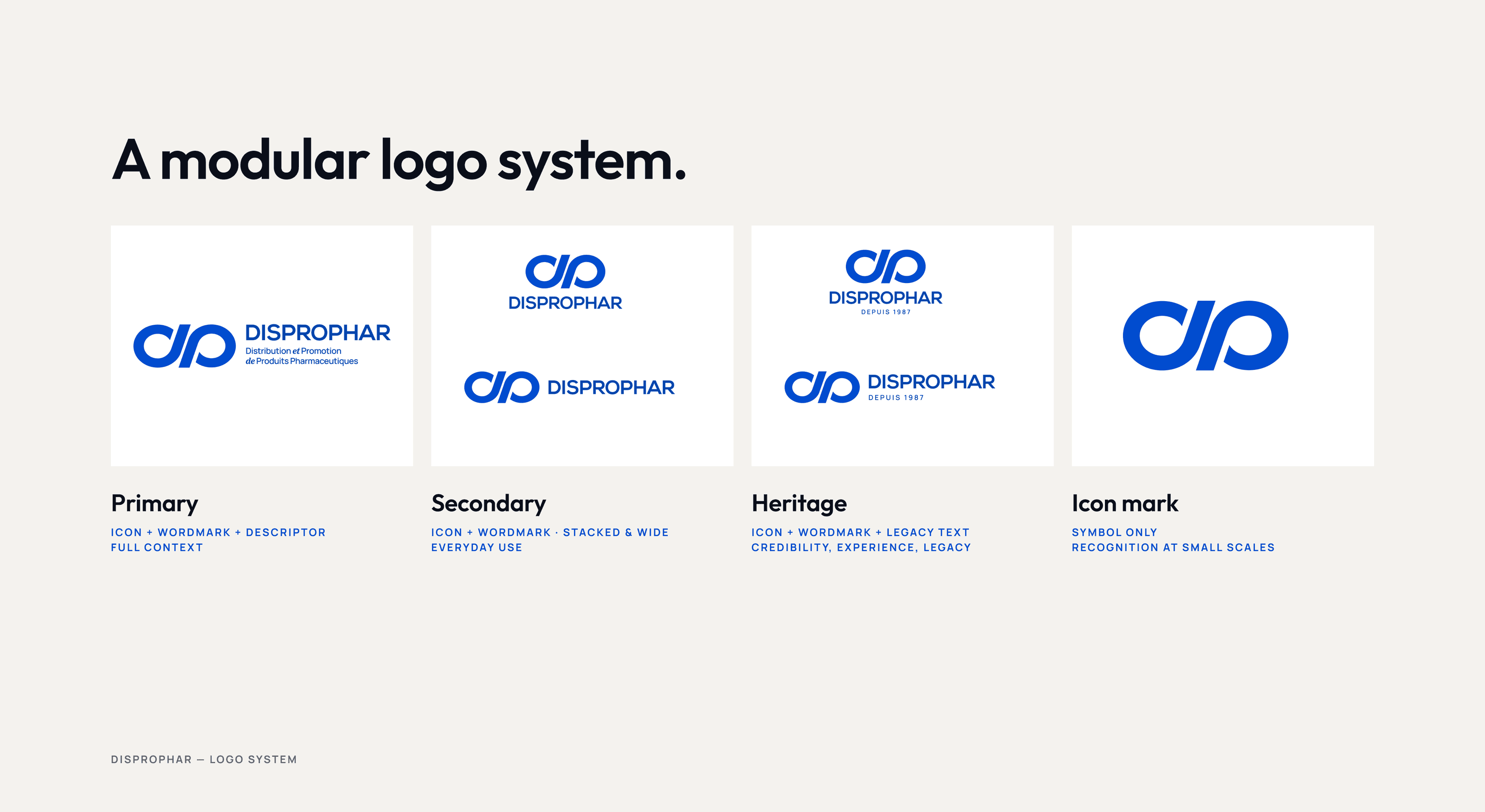
Built a modular system with primary, standard, heritage, and icon versions, one for every context from a building facade to a social avatar.
Locked it all into 18 pages of brand guidelines in English and French, so every partner, printer, and pharmacy gets the same Disprophar.
Outcome
3 rounds and 7 weeks later, Disprophar has a mark that feels unmistakably its own. Familiar enough for the partners who have known the brand for decades, but sharp and flexible enough to lead in digital. The new identity is backed by a system designed to keep the brand consistent wherever it shows up.
Approach
We started with what had to stay. The loop already belonged to Disprophar, so the job was to make it stronger, not to replace it.
The first round tested three concepts, including ideas built around the distribution network. The second narrowed it to two directions: keep the infinity loop, or move to a DP monogram. The loop won.
From 3 we refined the loop into a symbol Disprophar can own, then tested 4 typography options before choosing the wordmark that sits beside it. The guidelines then set how the mark, colors, and type get used.
The carton and shelf-label scenes are concept applications made for this case study.




"We hired the team to redesign our logo. The team was very responsive. We are very satisfied and would recommend their services"
Raphaelle, Disprophar S.A.


