Digital Pro
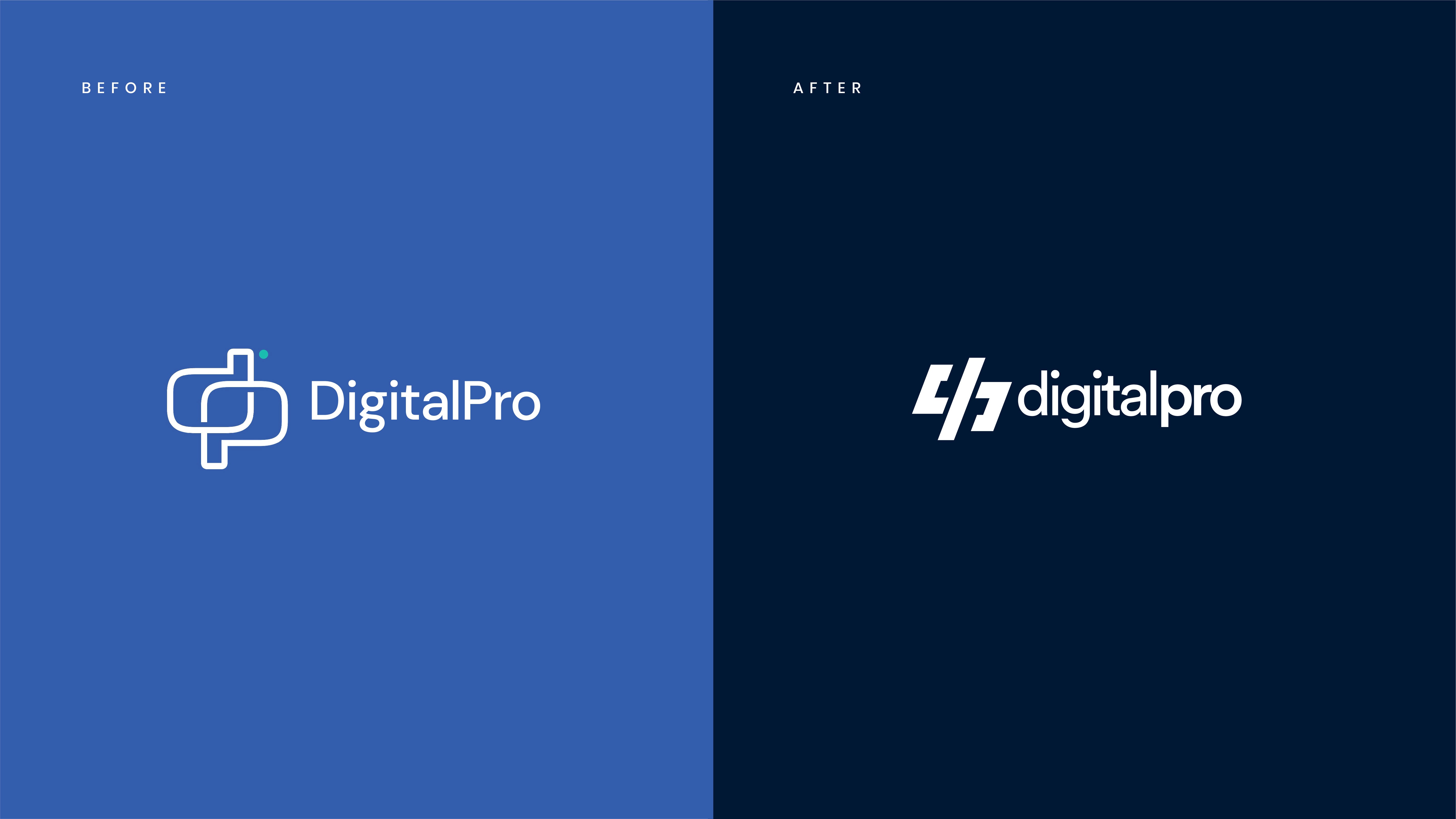
A logo rebuilt from the old monogram.

Overview
Digital Pro helps people and businesses show up online. The old monogram was worth keeping. We redrew it so the mark feels current and still belongs to them.
Services
Logo Design
Rebrand
Challenge
A digital-services logo can collapse into a generic code bracket. The monogram was the useful part. The risk was losing it while chasing a more technical look.
What we did
Redrew the logo from the previous monogram.
Used the code symbol as a reference, then moved past it.
Tuned the mark so it stays readable at a small size.
Outcome
A logo that still starts from Digital Pro’s monogram, with a clearer link to the work they do.
Our approach
The previous monogram was the right place to begin. People could already see the brand in it.
We kept that skeleton and looked at the code symbol only as a way to sharpen the silhouette. The aim was a mark that feels current on a website and still works as a small icon, without pretending the company is a piece of software.