Logo Design
Rebranding
Winecom
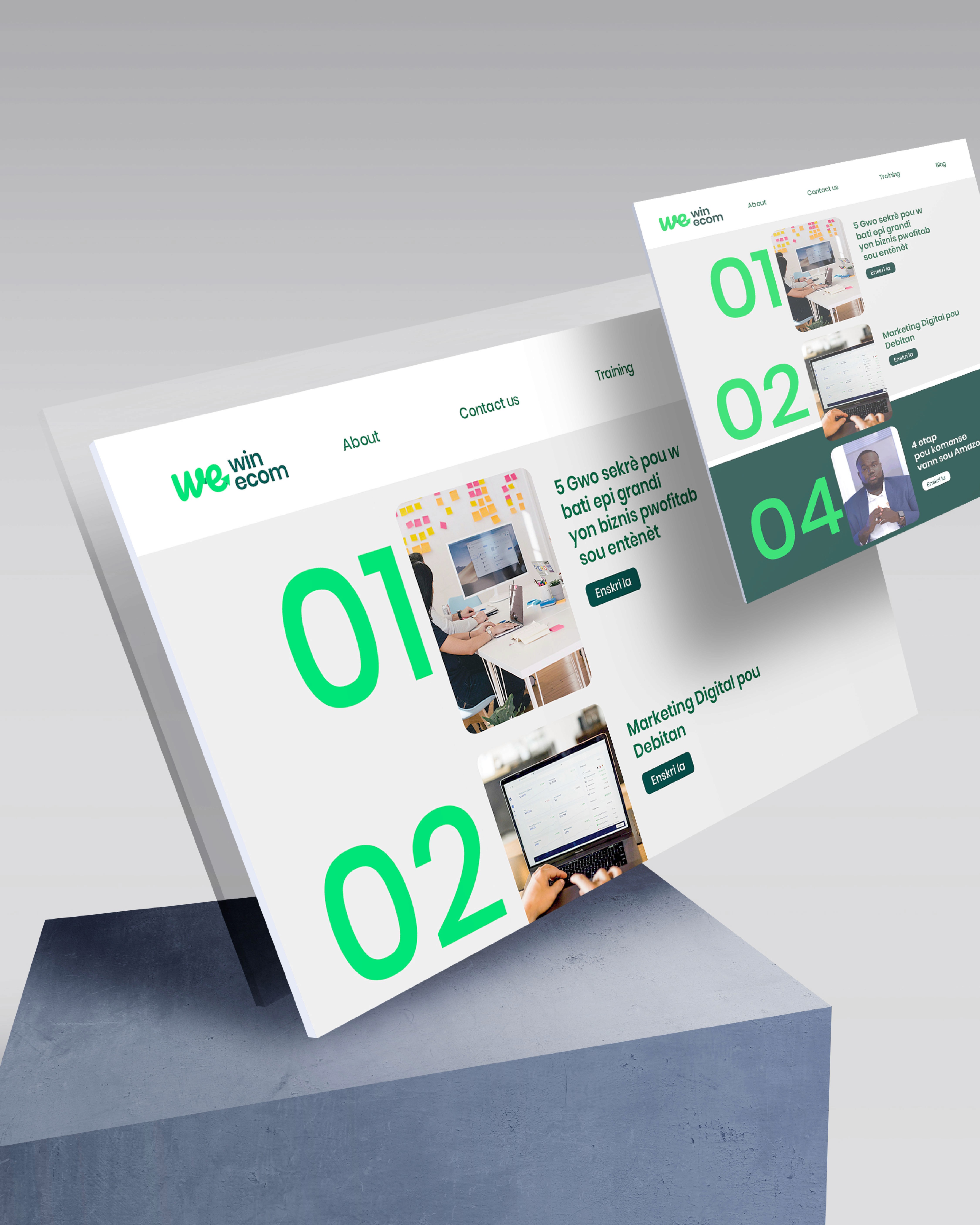
Win Ecom is a platform focused on helping people establish a strong online presence and teaching them effective strategies for selling products online. With expertise in e-commerce and marketing strategy, Win Ecom is dedicated to guiding users in growing their digital businesses.
Our Approach
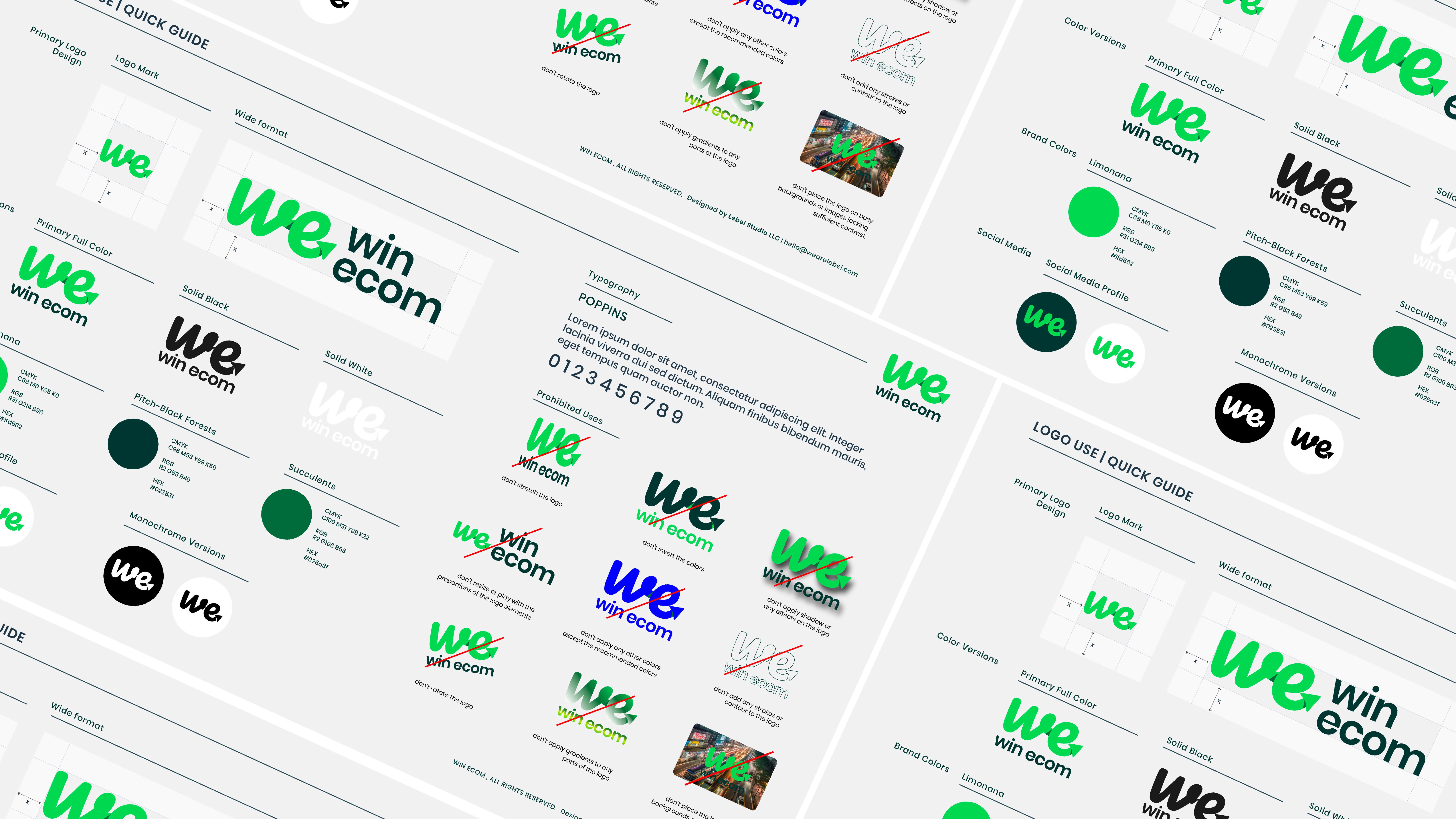
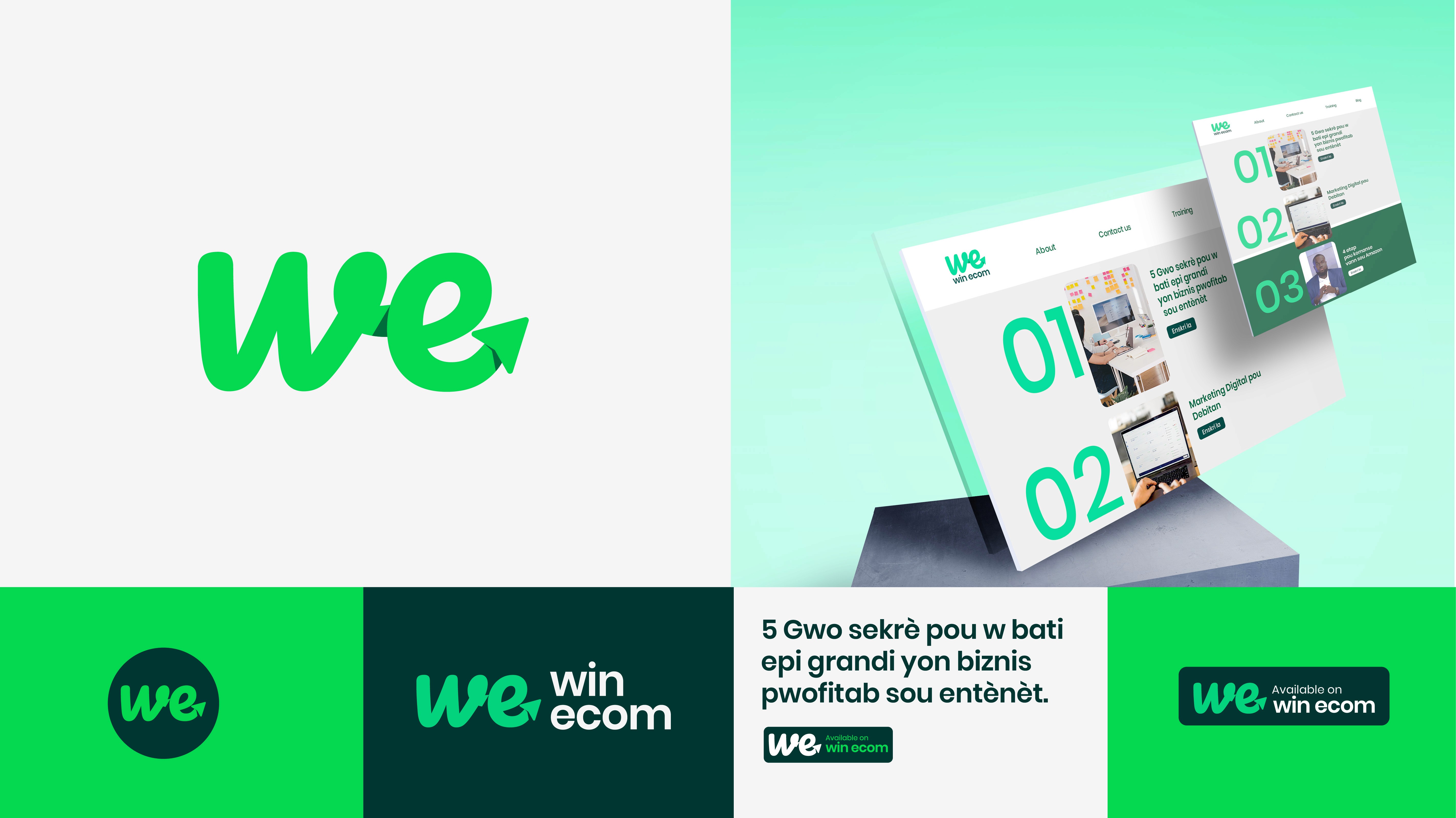
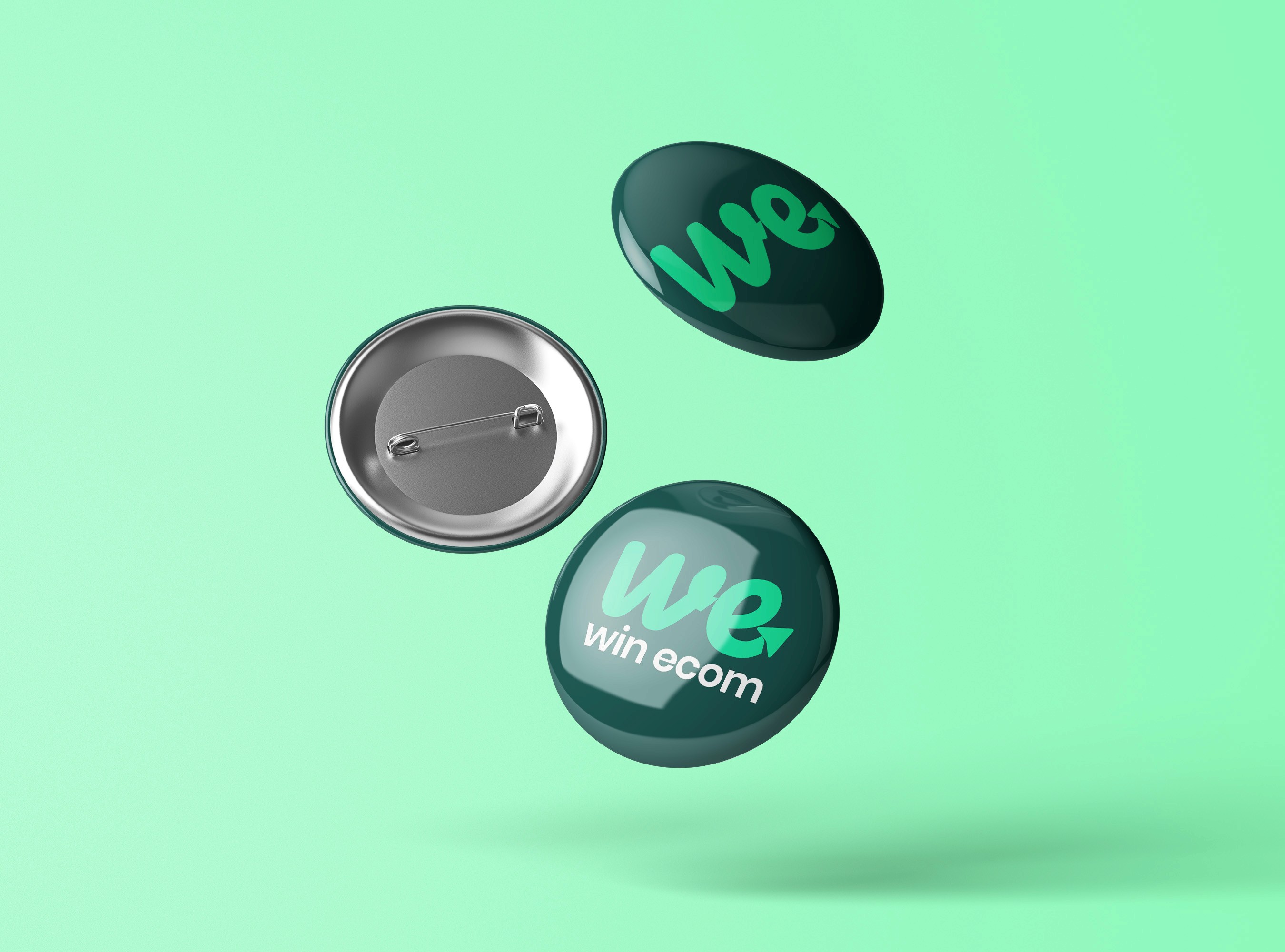
After our first brainstorm session, we came to the conclusion their logo needs an uplift and together we determined the right approach for a successful. The new logo should be versatile, easily adapting to both digital and print platforms.
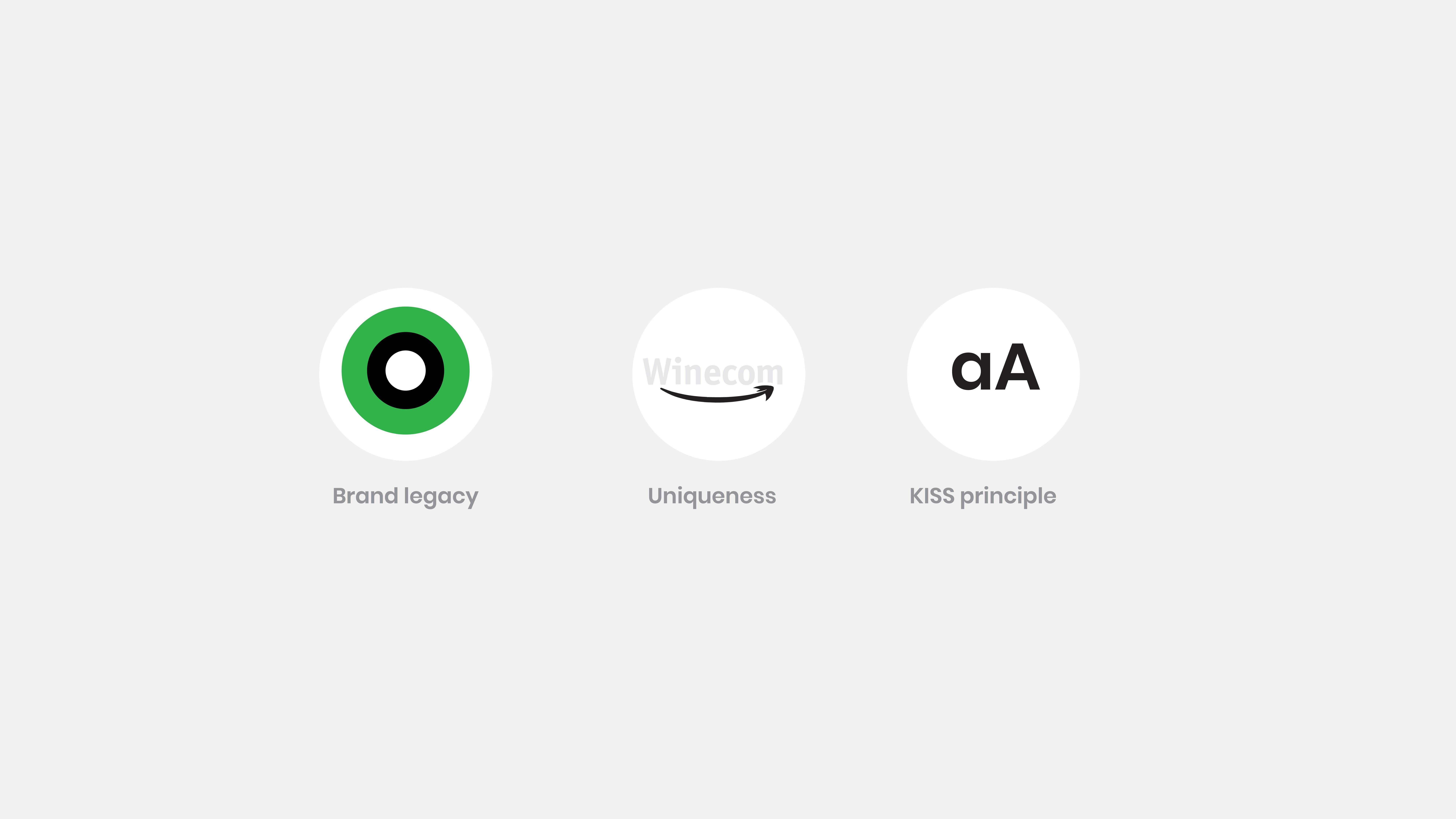
Brand Legacy
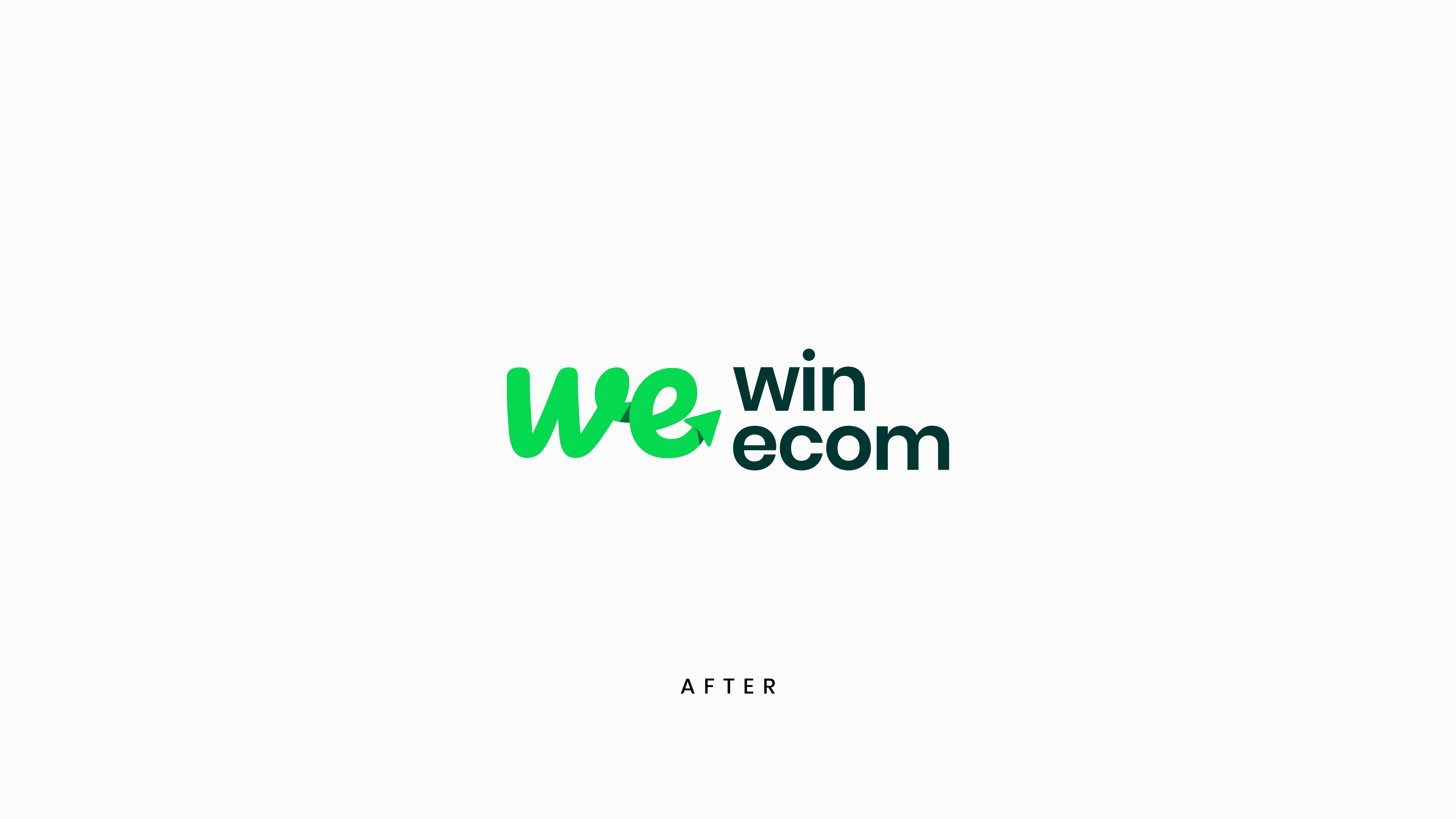
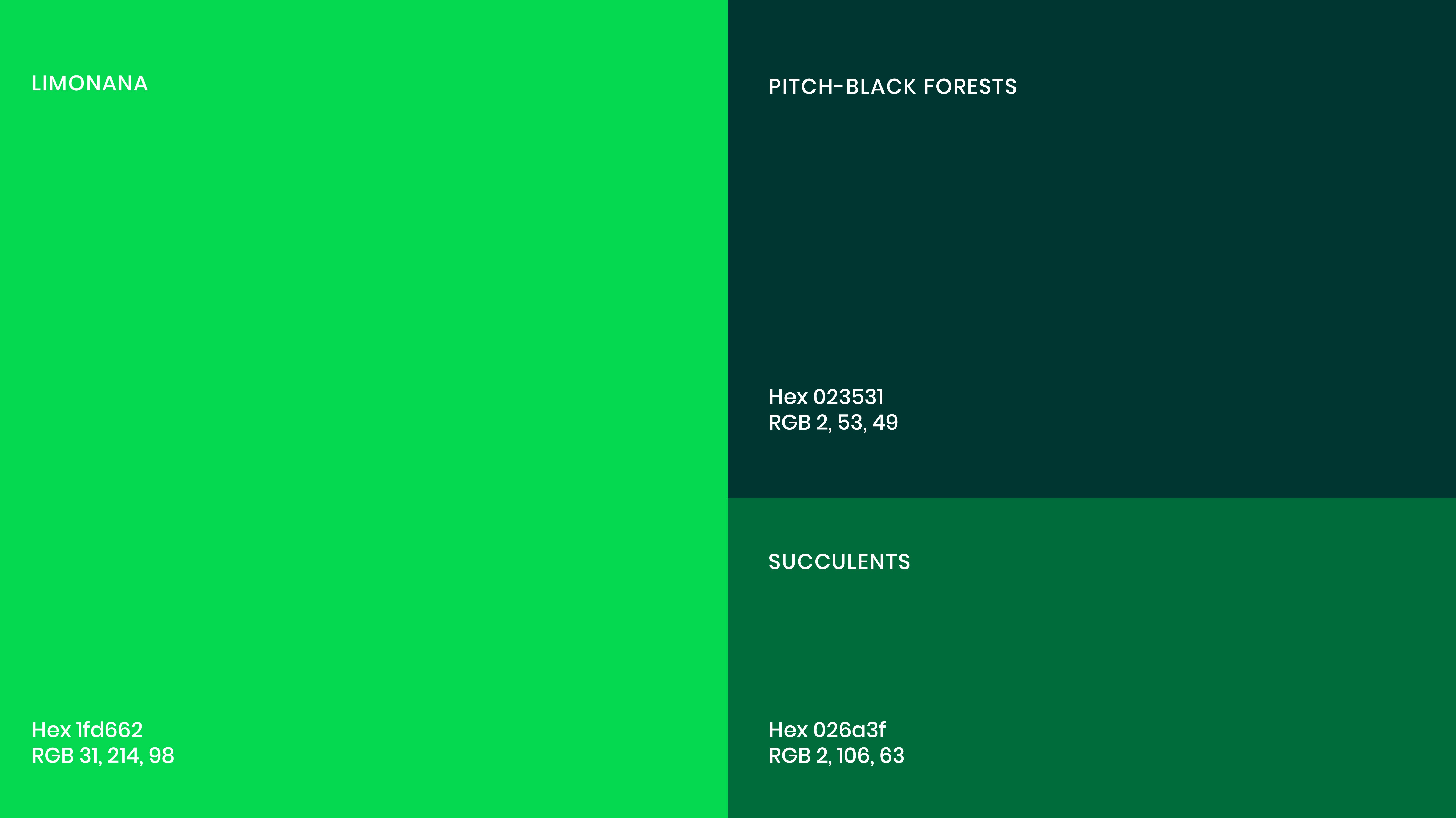
We decided to maintain Win Ecom's color scheme and iconic arrow shape while refining some elements.
Uniqueness
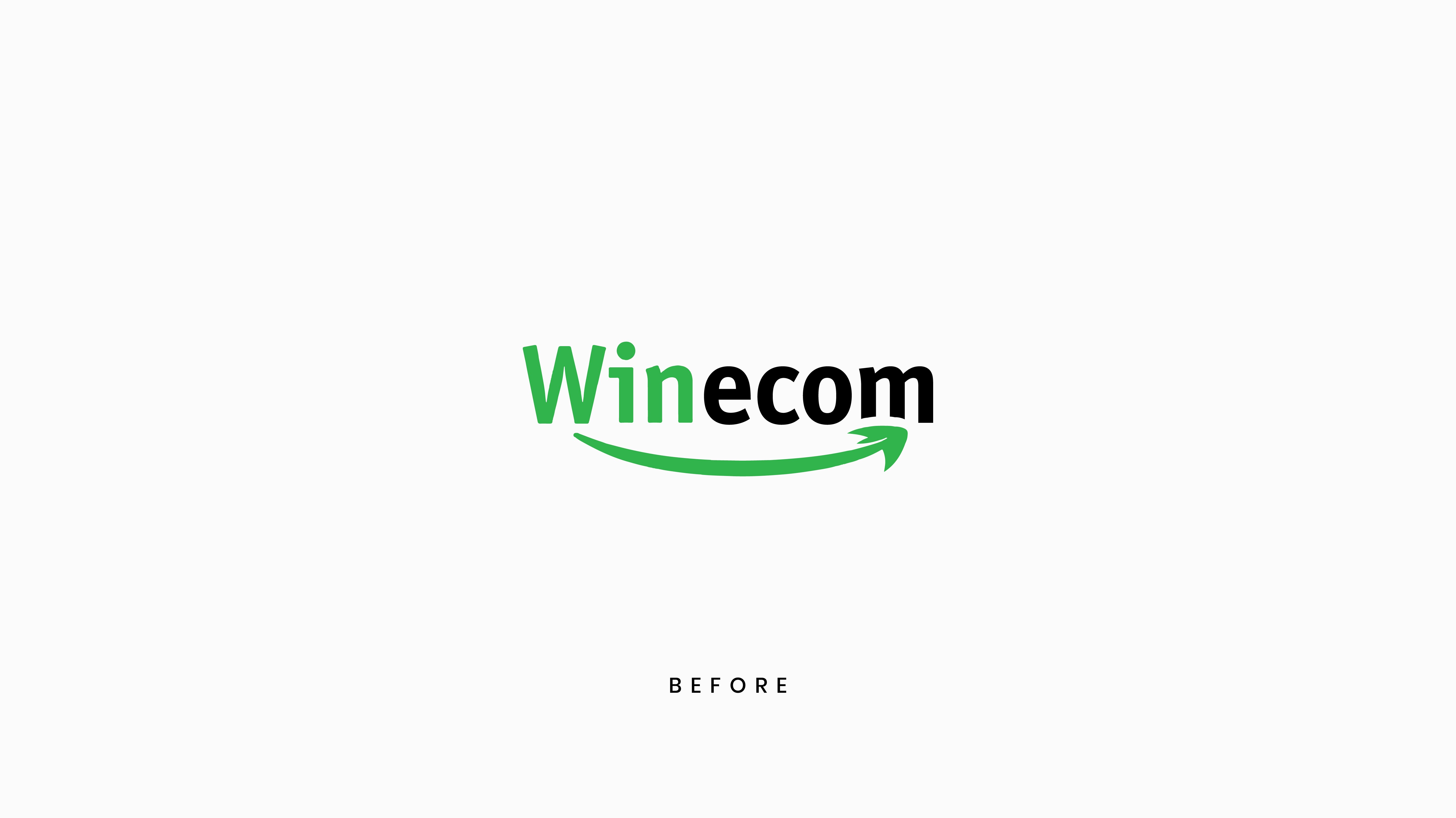
The previous mark was too similar to Amazon's logo. We redefined the structure of the existing logo.
KISS Principle
Through a couple of experiments, the Keep It Short and Simple method allowed us to break the previous mark, prioritizing simplicity and clarity. By combining text and shapes, it just works.
Core Values
Modernity
Accessibility
Professional Expertise
Clarity & Innovation
Target
Ambitious businesses and entrepreuneurs
Education professionals
